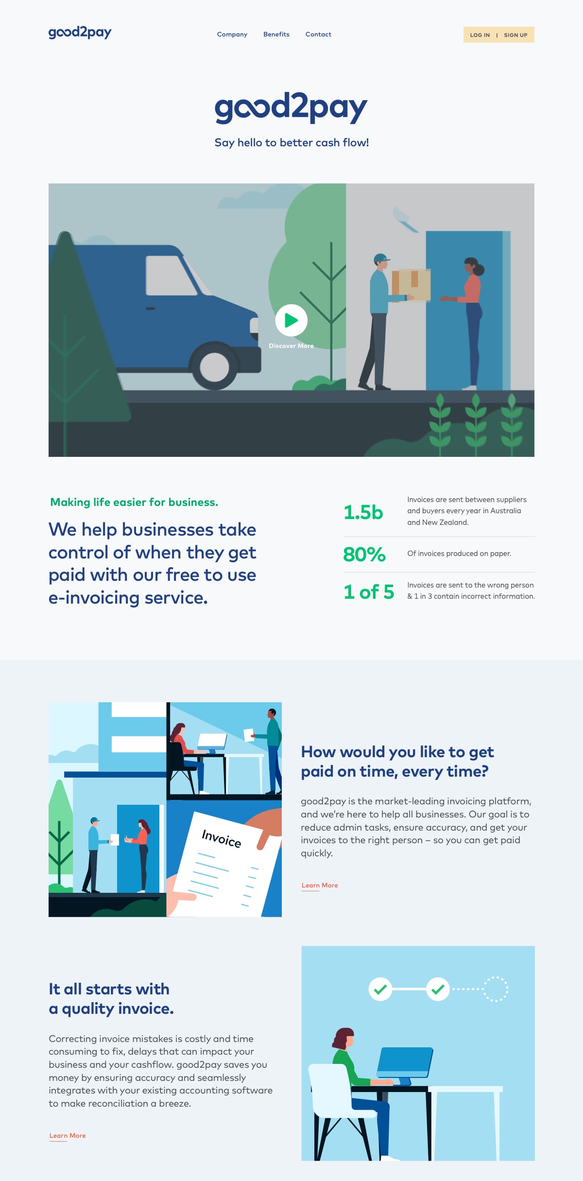
Branding and site for good2pay
good2pay seeks to improve business payments, making life easier for SMEs. Through easy-to-use payment solutions good2pay will improve cash flow and working capital.
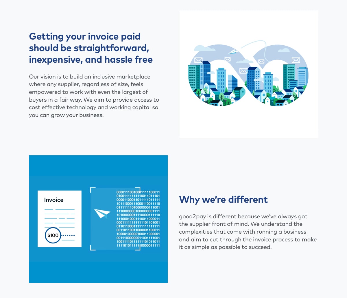
The design direction follows a simple and friendly approach to reflect an ethos of “doing good”. It visually portrays clarity and confidence with a human feel.


During the brand discovery we investigated good2pay’s competitors, target audience, defining personas and shaping the brand mantra – “improving business payments”. We focused on the word “good” and ways to effectively illustrate it within the logo. The new logo needed to engage and appeal to a broad range of suppliers and reflect simplicity.
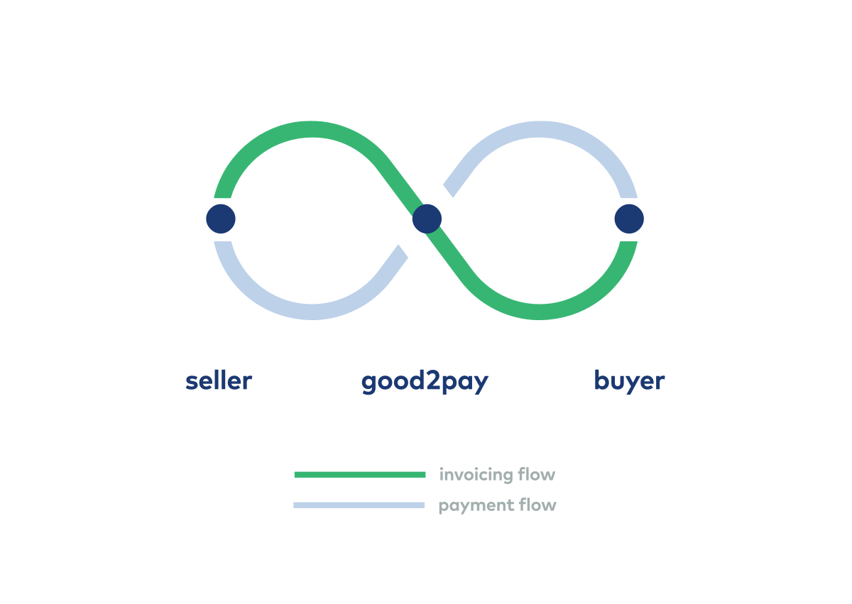
Logo Mark Origins
Primary Logo Lockup
Secondary Logo Lockup
Primary Logo Lockup Reversed
Creating the visual language
We defined a colour palette consisting of blues, greens and light grey to represent the fintech industry. The primary colours were extended across a secondary palette along with additional bright accent colours to highlight calls to action. This was complemented by a modern and geometric sans serif typeface to convey a friendly, human feel.


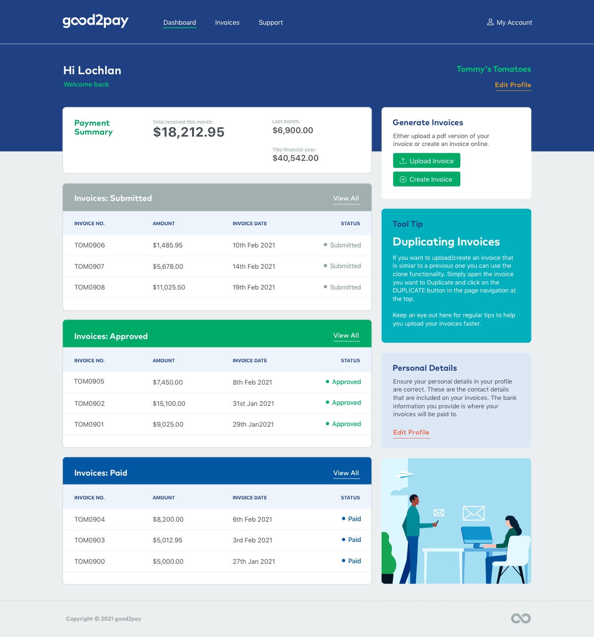
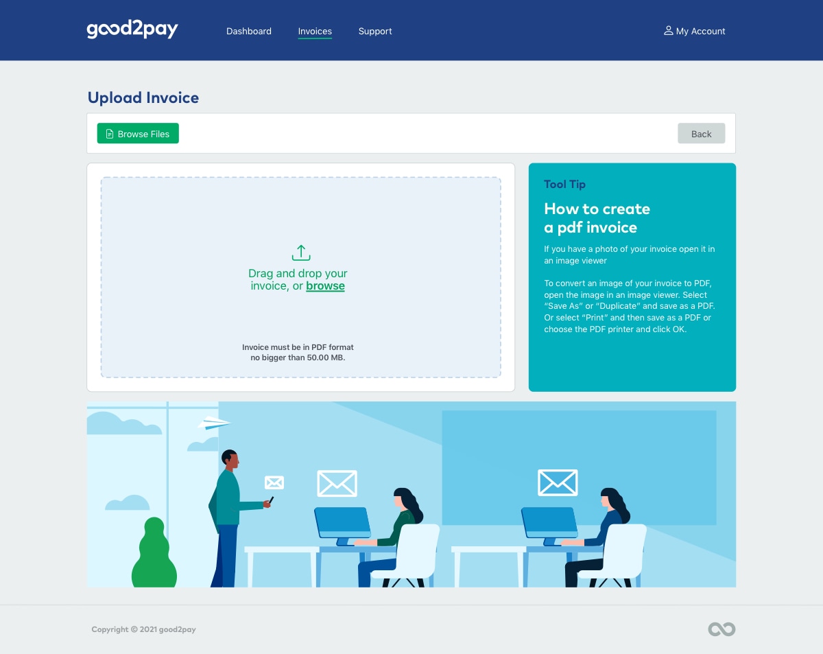
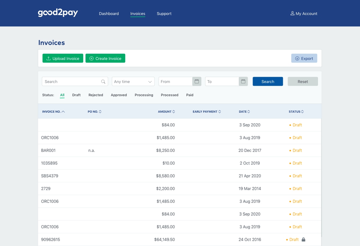
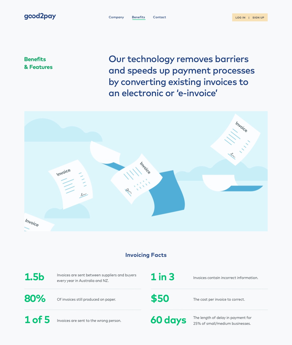
After we established the visual language, we provided a visual identity suite complete with brand guidelines and created wireframes for the brand site. We applied the visual language to create a clean and bold website showcasing the good2pay product as an easy-to-use, no risk and reliable solution.
The design was extended across the good2pay app and when it was ready for testing we conducted a design review and brand audit to ensure the visual language was coherently and consistently applied.