
Brand refresh & print collateral for Tasman Eco
Tasman Eco is one of Australia’s leading producers of nursery furniture with over 30 years experience and is well respected by customers and retailers alike.
Tasman Eco brought in three winged fly to define their brand strategy and refresh their visual identity to achieve a stronger, consistent brand identity and elevate their branding across all touchpoints.


We collaborated with Tasman Eco to define the brand strategy, revitalise their brand identity, and maintain a cohesive design throughout all communication materials. We asked an array of pertinent questions to gain a deep understanding of Tasman Eco’s business, competitors, and audience. Insights gathered during the brand discovery helped redefine their brand values, personality, and voice.
The visual identity was refreshed, removing the previous circular logomark, and the logotype became the main logo. This reflected a cleaner, simpler, and more contemporary approach.
Primary Logo Lockup
Primary Logo Reversed
Primary Logo Tagline Lockup
Primary Logo on Tasman Yellow


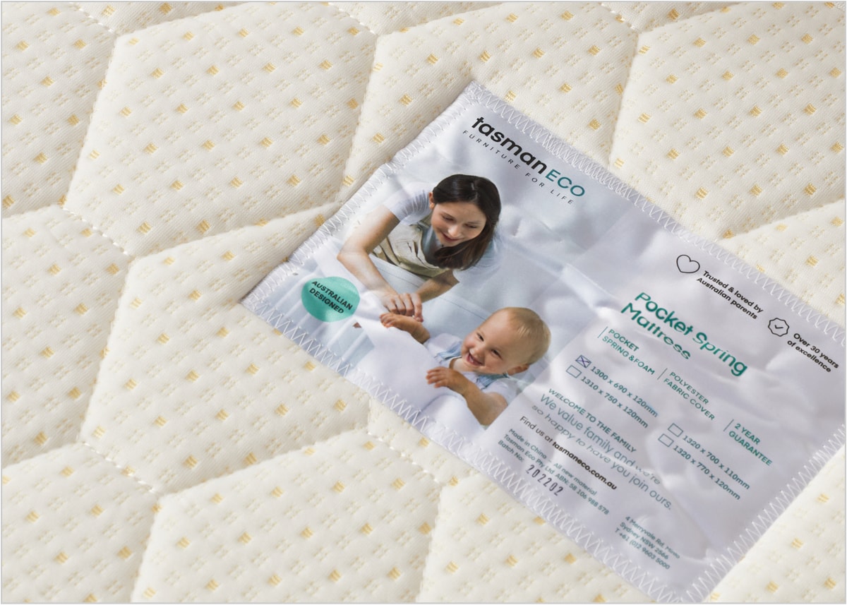
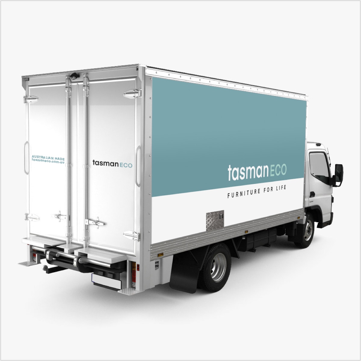
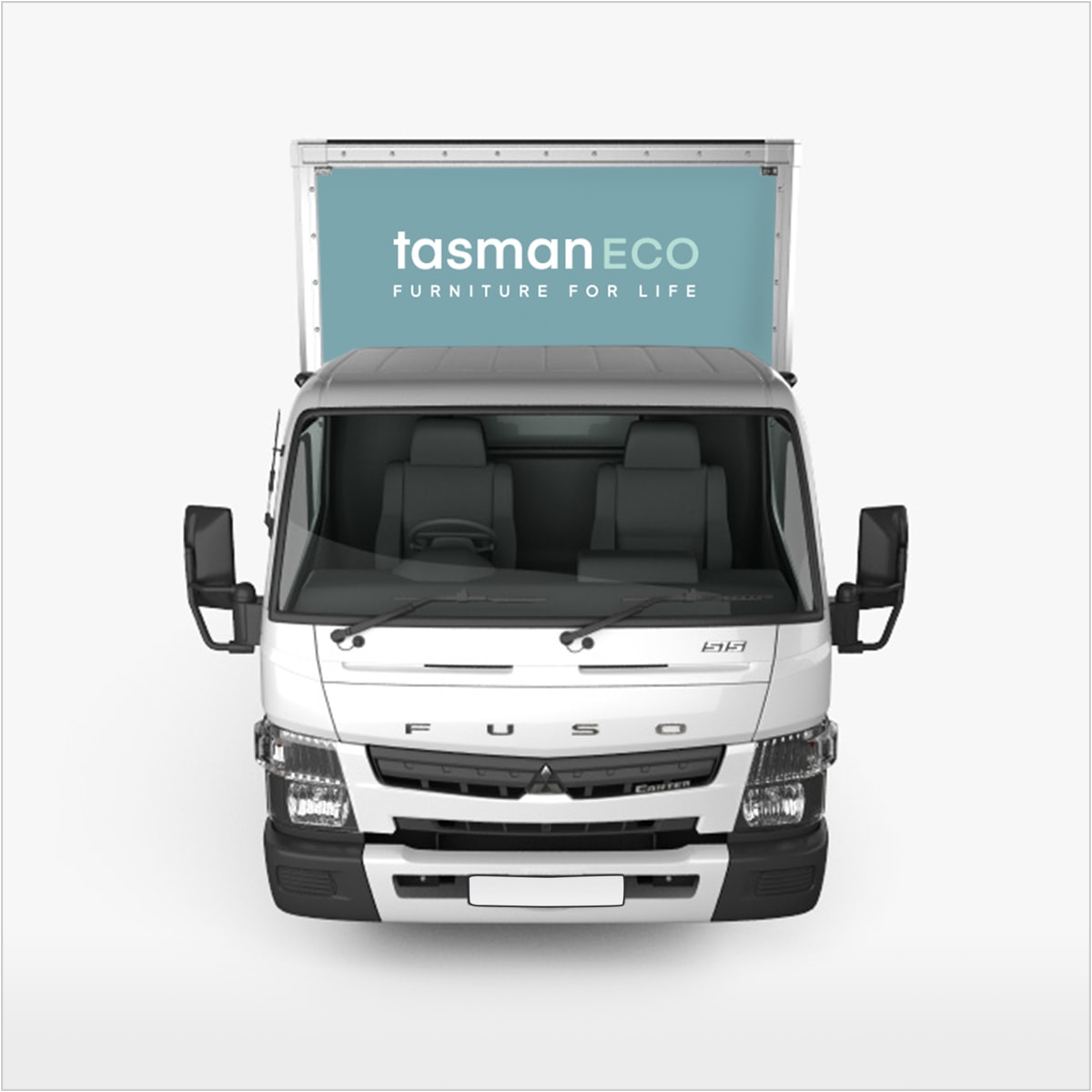
The brand refresh extended across a range of communications collateral comprising product labels & tags, mattress loops, product badges, signage and partner collaboration collateral.
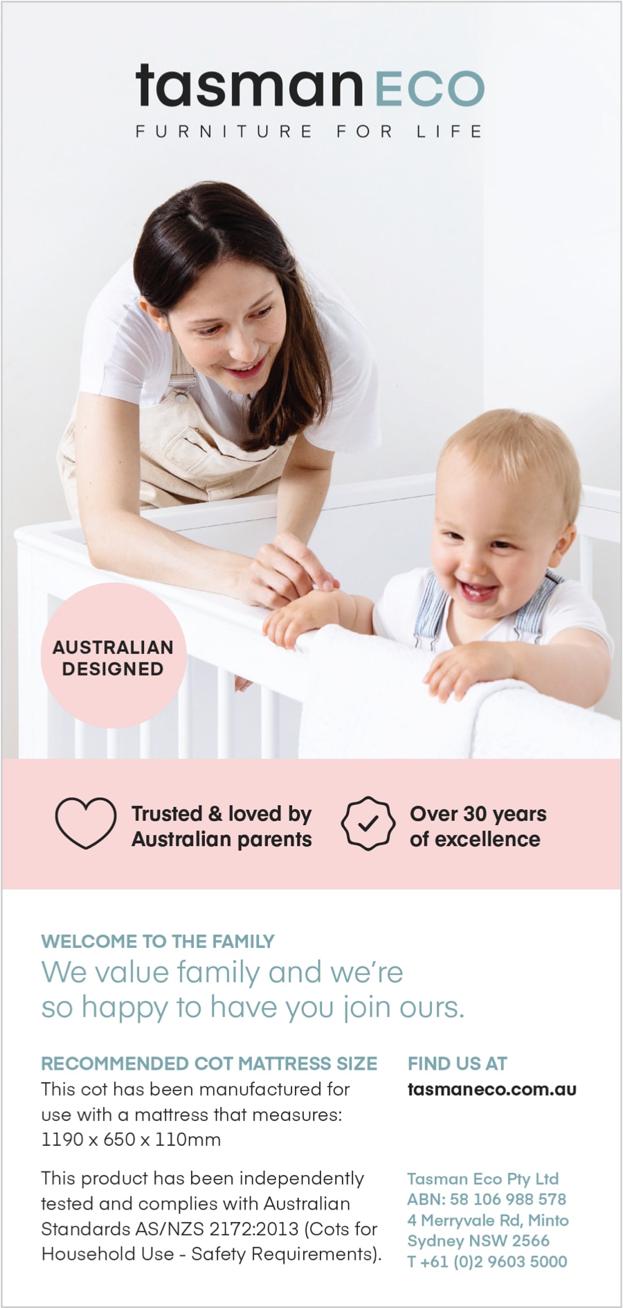
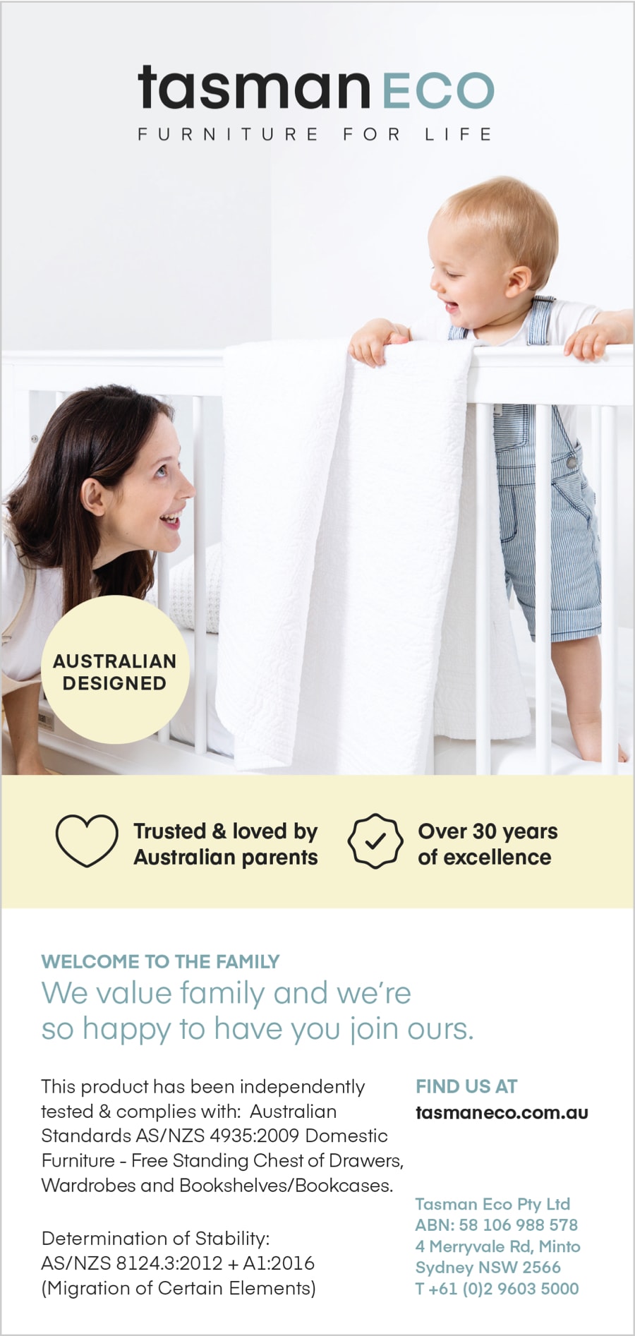
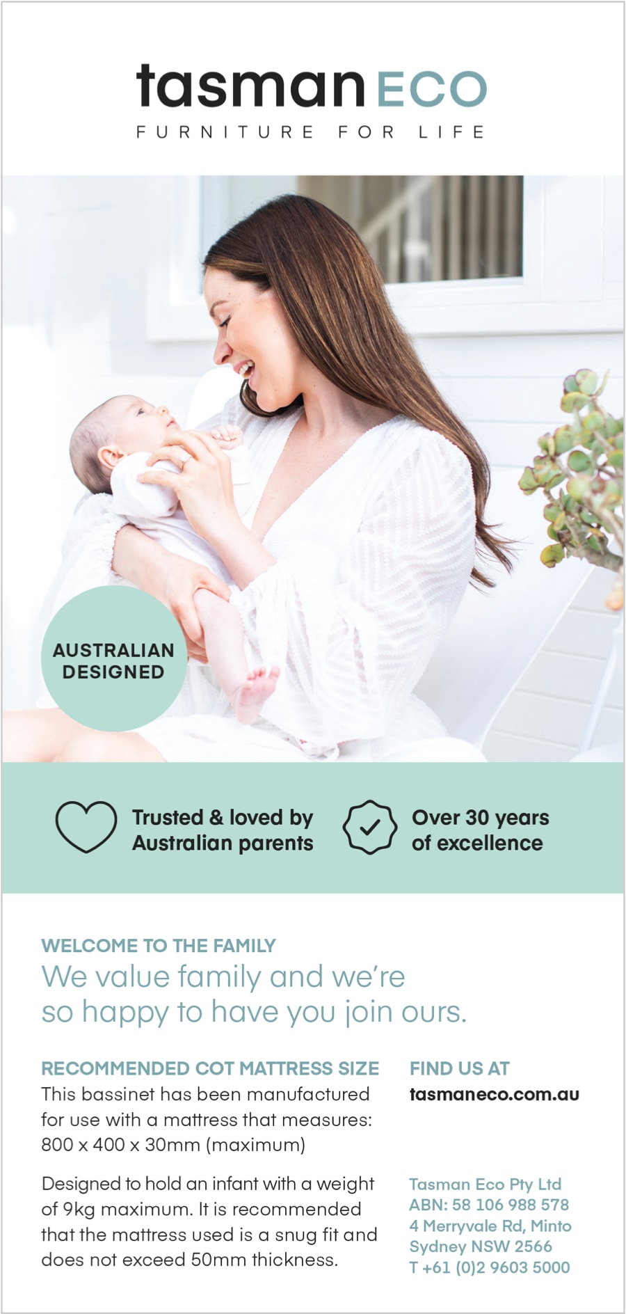
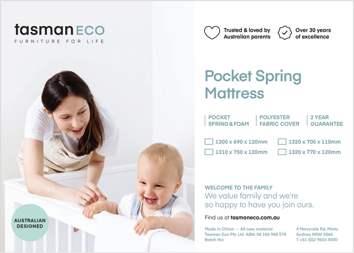
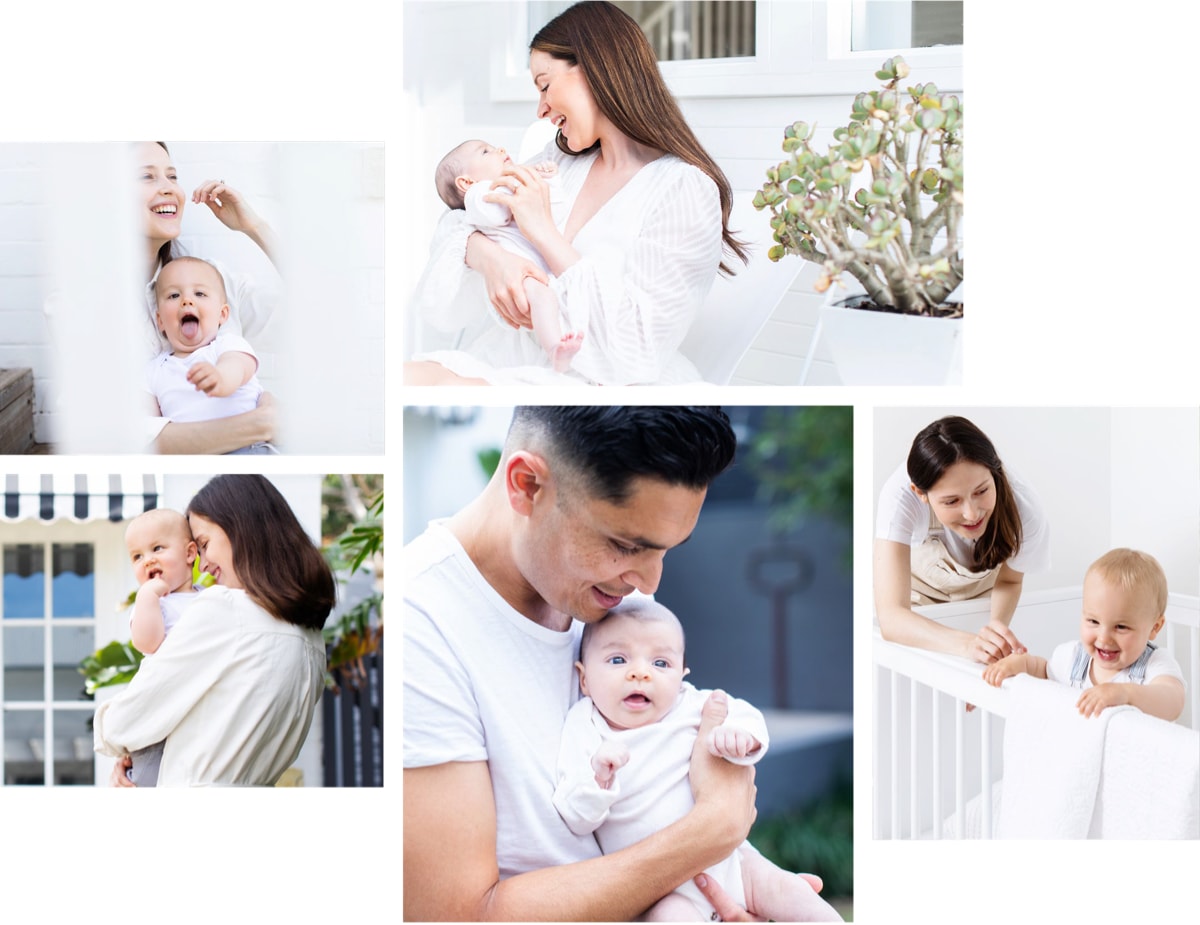
The brand imagery comprised lifestyle shots reflecting how the customers will feel when they become part of the Tasman Eco family. They comprise family photos of babies, toddlers and parents expressing happiness, joy, closeness and enjoyment.
"three winged fly worked with us through an entire brand review and rebrand, they brought a freshness, a professional approach and eye to the process, that allowed us to define what our brand needed to look like, but also help us to identify what it could look like.
Brie and Dylan always gave us an incredible, excited energy for our work and what we wanted to achieve, going above and beyond what we had asked of them. We love working with them and are grateful for the time, effort and talent that they have brought to our business. Looking forward to working together more."