
Sub-brand visual identity for Aspire
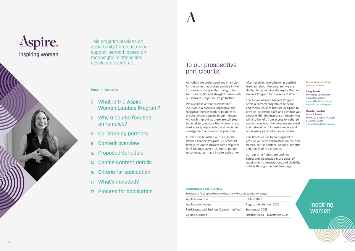
Aspire exists to offer brokers the opportunity to participate in an intensive female leaders program. Targeting women in the insurance industry and specifically aimed at women in brokerages across Australia with senior roles and including leaders or future leaders.
Hollard brought three winged fly in to create a sub-brand identity to attract participants to enrol and align comfortably within Hollard and the positive aspects of the program.

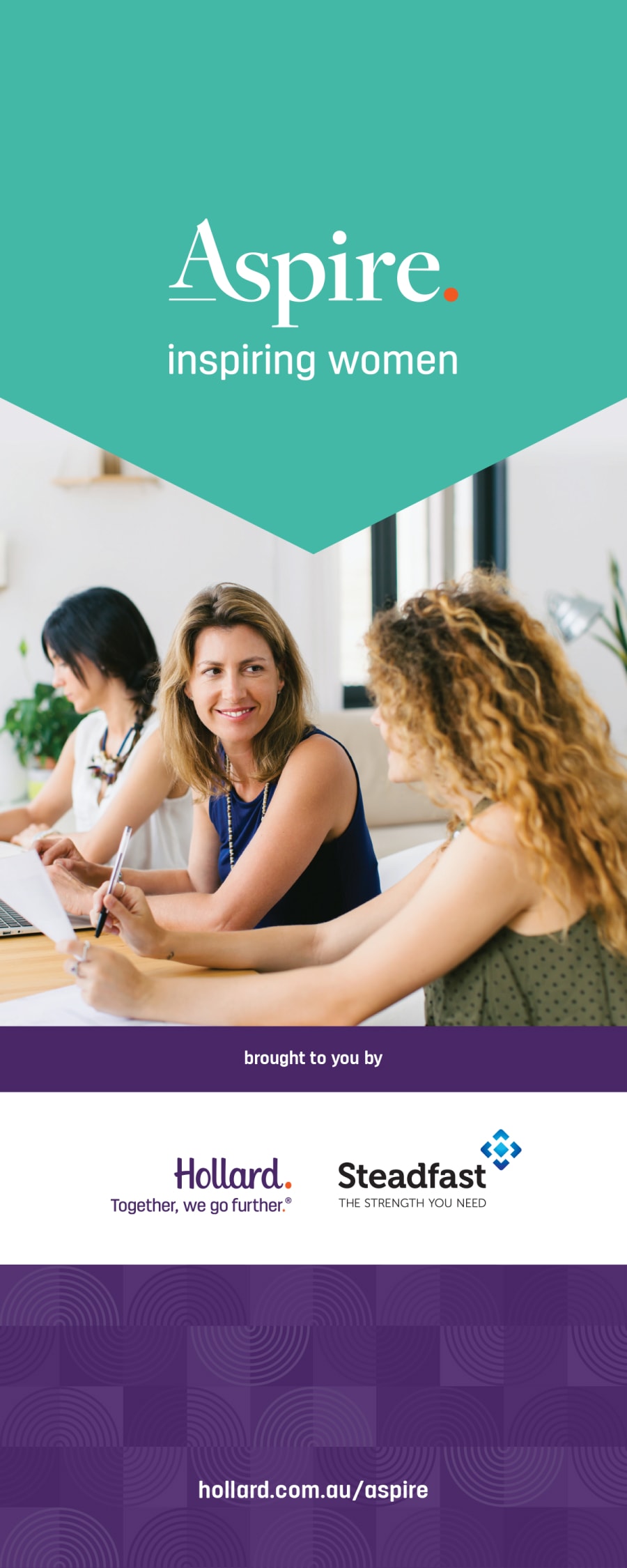
The display version of an elegant serif typeface was selected to convey professionalism and credibility. Keeping in mind the identity needed to engage and appeal to women in the insurance industry. The letter A is a little higher than the baseline to reflect it is reaching up. A unique ligature between “A” and “s” to reflect connectedness and the orange full stop is for consistency with the Hollard parent brand.
Primary Logo Lockup
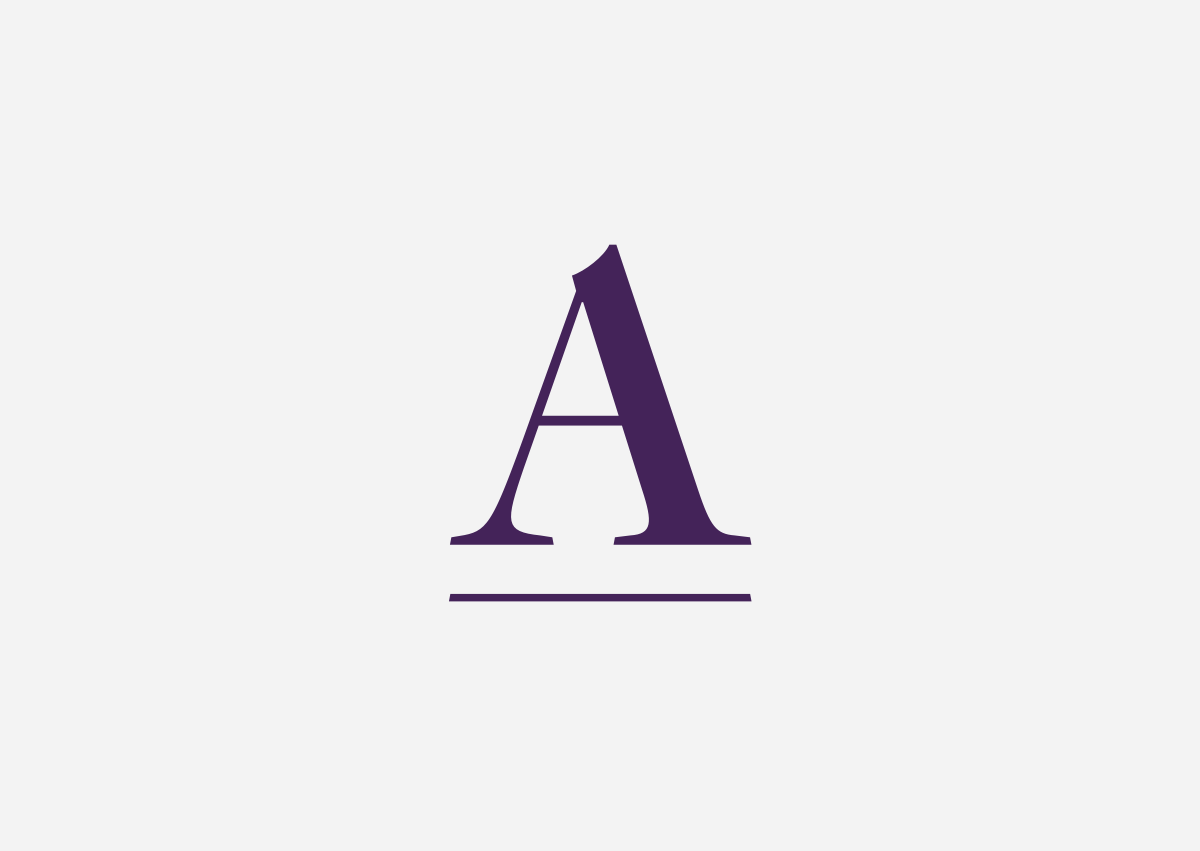
Monogram
Primary Logo Tagline lockup

Monogram reversed
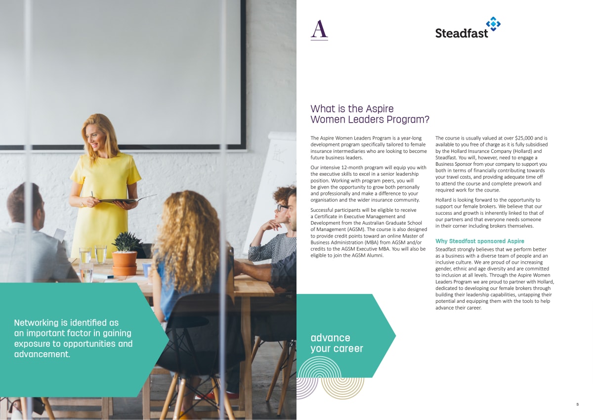
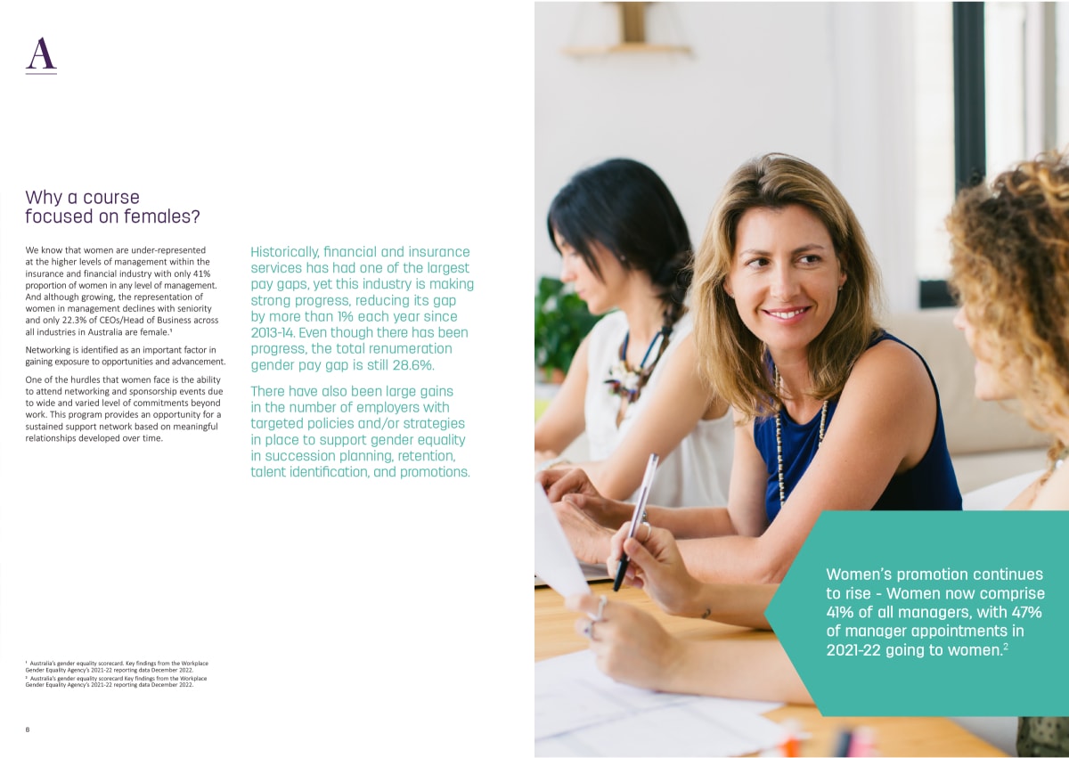
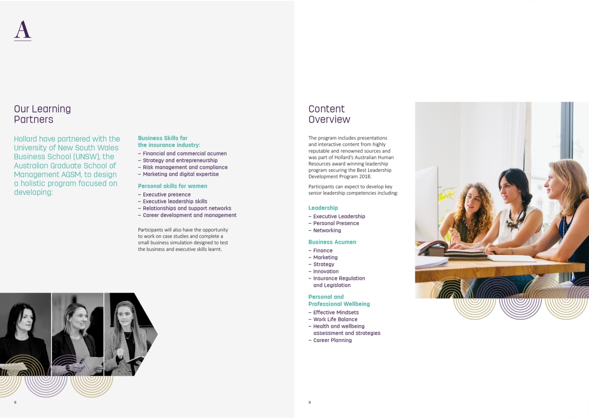
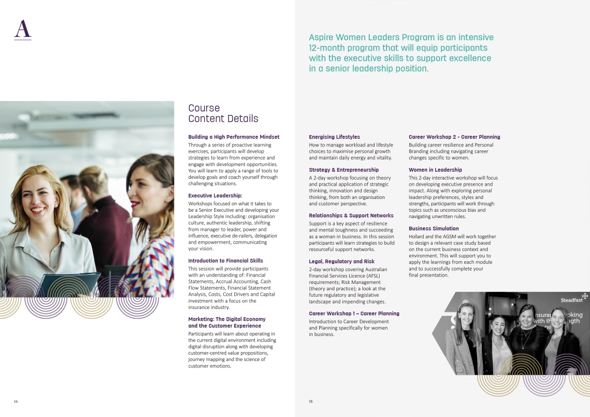
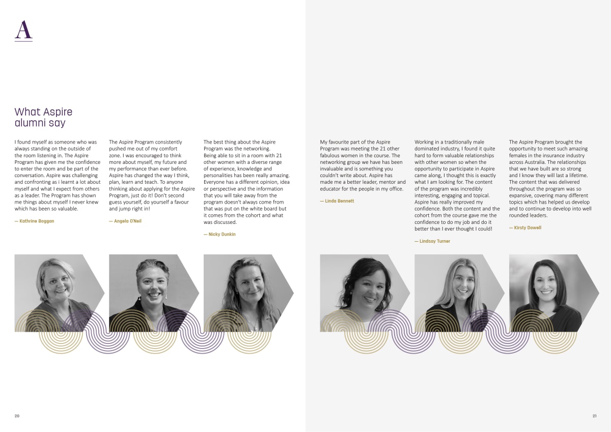
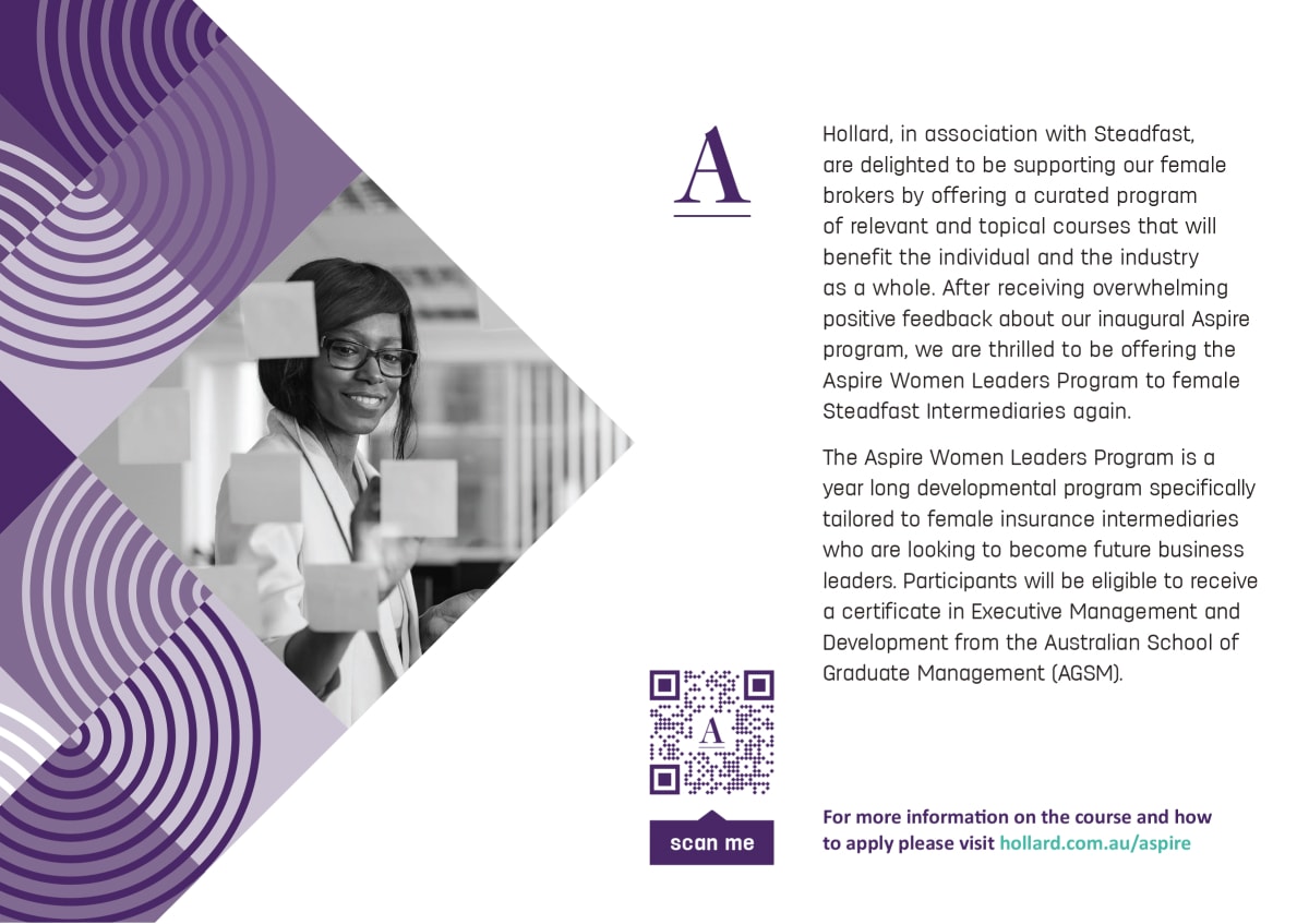
The new identity was extended across a range of communications collateral. The imagery selected for the sub-brand had a business focus, reflecting confident women working together, leading and interfacing with clients and colleagues keeping in mind they aligned with the playful and unconventional nature of the parent brand.


“Brie has a fantastic eye for design and always nails the brief – coming up with amazing concepts and designs that bring our ideas to life. She is really easy to work with, and her assistance with everything from visual identities to image selection, branding for exhibition stands, and social media collateral has helped us share our story with our clients and customers.
I’d recommend Brie and the team at three winged fly to anyone wanting to bring a little inspiration and some strong design principles to their branding and creative campaigns, and I’m looking forward to working with her again soon.”
I’d recommend Brie and the team at three winged fly to anyone wanting to bring a little inspiration and some strong design principles to their branding and creative campaigns, and I’m looking forward to working with her again soon.”