
Branding for Surveyz
Surveyz was created to be simple, understandable, easy to use and rewarding while helping to provide Australian businesses with the data and insights they need to make better decisions.
The design direction follows a colourful and punchy approach to reflect the fun, simple and straightforward nature of the brand. It visually demonstrates that Surveyz is playful, open, not afraid to be bold, honest and if necessary outspoken, to ‘tell it how it is’.


We started the branding process by researching Surveyz’s competitors and target audience. Insights gathered during the brand discovery helped define their brand values, personality, and positioning. We focused on the name to create a strong, memorable association with the core business offering and ways to effectively illustrate it within the logo. The new logo needed to embody the brand mantra “be bold, keep it simple, easy and rewarding.”
Primary Logo Lockup
Primary Logo on colour

Logomark
Primary Logo Tagline Lockup
Creating the visual language
The visual language comprises bold, strong typography with playful and catchy copy to capture the enthusiasm Surveyz brings to the market. The tick reflects the ease and simplicity of the brand echoing the checkboxes from a survey. The tick and letter V provide an optical illusion that’s memorable.
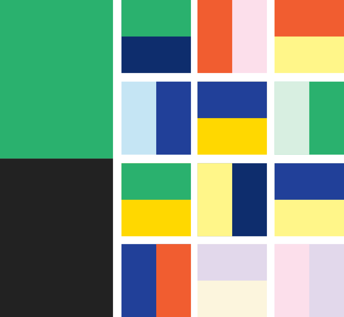
We created a bold, and expressive colour palette with a wide range of colours to reflect different traits and the energy of Surveyz. Including a balance of bright and punchy colours with lighter colours to contrast. This was complemented by a strong and simple san serif typeface which comprises clearly-differentiated letterforms.


Fonto engaged three winged fly to develop and build the brand assets prior to the launch of our Surveyz offering. The outcome was an excellent, clear and clean visual identity suite, ready for taking to market. It was a pleasure to work with Dylan and Brie.